


Sunny Delight : A New Era of Freshness
This fictitious rebranding project of Sunny Delight was born from the desire to reinvent a brand that resonates with our childhood memories while infusing it with a contemporary touch. It’s a story of renewal, reinvention, and emotional connection with a generation that grew up with this iconic drink.
Brand Overview
Sunny Delight, created in the 1960s, quickly captured the hearts of children and families with its promise of fruity flavors and pure pleasure. Known for its distinctive taste and iconic packaging, the logo has become synonymous with joy and freshness.

What the challenge?
The mission was clear: to transform Sunny Delight. We needed to modernize the brand to appeal to contemporary tastes without losing the essence that made it successful. The goal was to create a visual identity that speaks to both today’s children and nostalgic thirty-somethings. Our strategy? To move the brand from the fresh juice aisle to a range of non-carbonated sodas with bold flavors, in line with our target audience.
Logo: Craftfing the new idendtity
The logo pays homage to its predecessor while injecting new energy. I opted for a typography style reminiscent of papercut/comic strips that matches the identity and echoes the graphic codes of cartoons in our collective subconscious. Each letter is organically oriented, evoking dynamism. The responsive logo adapts to all formats, embodying the energetic spirit we wished to instill.

Visual Principles
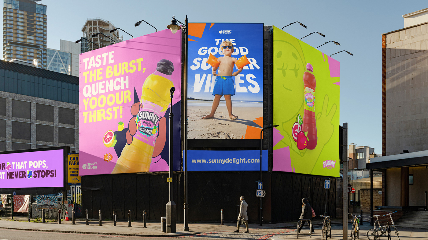
The graphic identity of Sunny Delight is vibrant and refreshing. It exudes joy and a desire to push boundaries. The pop and vibrant colors echo energy and vitality, while the papercut/comic strip typography suggests movement and the freshness of youth. Each design component illustrates our vision: an effervescent, fearless, and constantly bright brand. Our visual foundations are dynamism, fluidity, and variability of proportions.
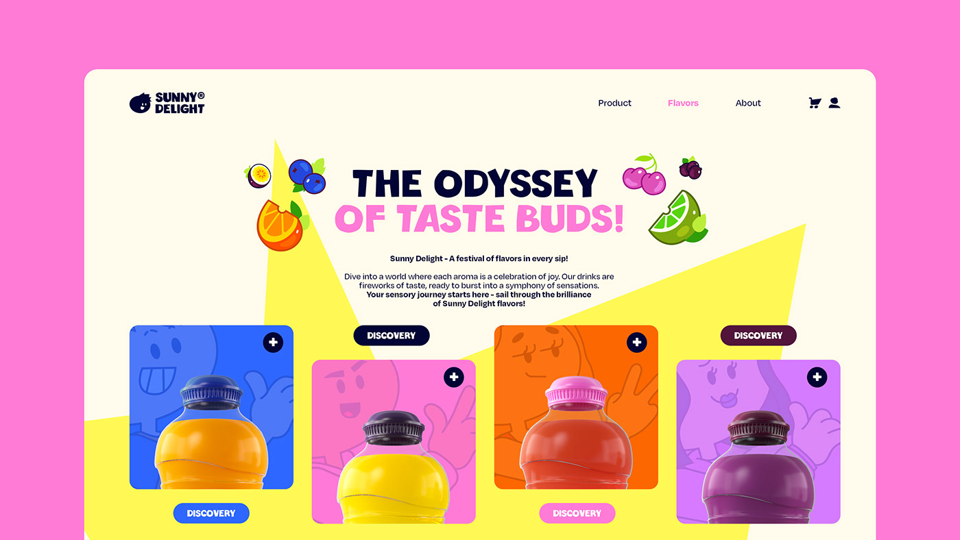
Illustration at the Heart of the Brand
A collection of colorful illustrations brings Helper to life with playful charm and depth. Each illustration adds a touch of whimsy to the brand, infusing it with personality and vitality. Beyond their delightful appearance, these illustrations serve a dual purpose: not only do they enhance the visual appeal of our brand, but they also serve as practical tools for communication, breaking up designs and conveying our key values in a engaging way.

Fluid Form: Reimagining the Sunny Delight Bottle Experience
The redesign of the 0.5L and 1.75L bottles prioritizes ergonomics while infusing new energy. The reworked cap preserves the legacy of the old bottle, while the embossed waves evoke freshness and the aqueous base of the products. It’s a fusion of functionality and nostalgia, designed to delight the senses and enhance the drinking experience.

Uniting Generations
The heart of Sunny Delight beats for intergenerational harmony, aiming to unite long-time fans and new enthusiasts around the same beverage, thus fostering memorable exchanges. The simplicity of the flavors, the intuitiveness of the offerings, and the unique sensations provided by each moment shared with Sunny Delight are essential to the customer experience. These principles are reflected in every aspect of the brand, from the bottles to the website.


Is the Goal Achieved?
The sweet beverage sector is a competitive battleground, ruled by titans of consumption. The goal for me was clear: to stand out without straying too far from the proven standards that govern this field. It’s a delicate balance between visual originality and consumer expectations. I undertook this strategic and visual repositioning of the brand to refresh and make the products more attractive and accessible, while creating a “coolkids” ambiance that attracts and retains a young audience.
This journey through the fictitious rebranding of Sunny Delight is an invitation to rediscover a beloved brand, transformed yet still true to itself. I invite you to dive into this new era of freshness, to be seduced by a symphony of flavors, and to join the Sunny Delight community. I dare the adventure, I dare the taste, I dare Sunny Delight.
Creative Team
Art Direction: Théo Leparc
Illustrations: Théo Leparc, Charlotte Renoult
Logo & Graphic Content: Théo Leparc, Mathilde Jubault
Illustrations: Théo Leparc, Charlotte Renoult
Logo & Graphic Content: Théo Leparc, Mathilde Jubault
3D & Bottle Design: Élina Munier, Maxime Girard
UI & UX: Théo Leparc
Motion Design: Théo Leparc
A fictional rebranding project imagined by Théo Leparc
April 2024 — Thanks for watching
A fictional rebranding project imagined by Théo Leparc
April 2024 — Thanks for watching


